
One of my pet peeves is bad form design.
How hard would it be for the person designing a form to actually fill it out themselves and see if it works?
I was filling out a form similar to the one shown below (I don’t want to pick on the actual company whose form I was filling out), and to me some of the problems are obvious, even without filling in the form (you can click on the form to get a better view of it).
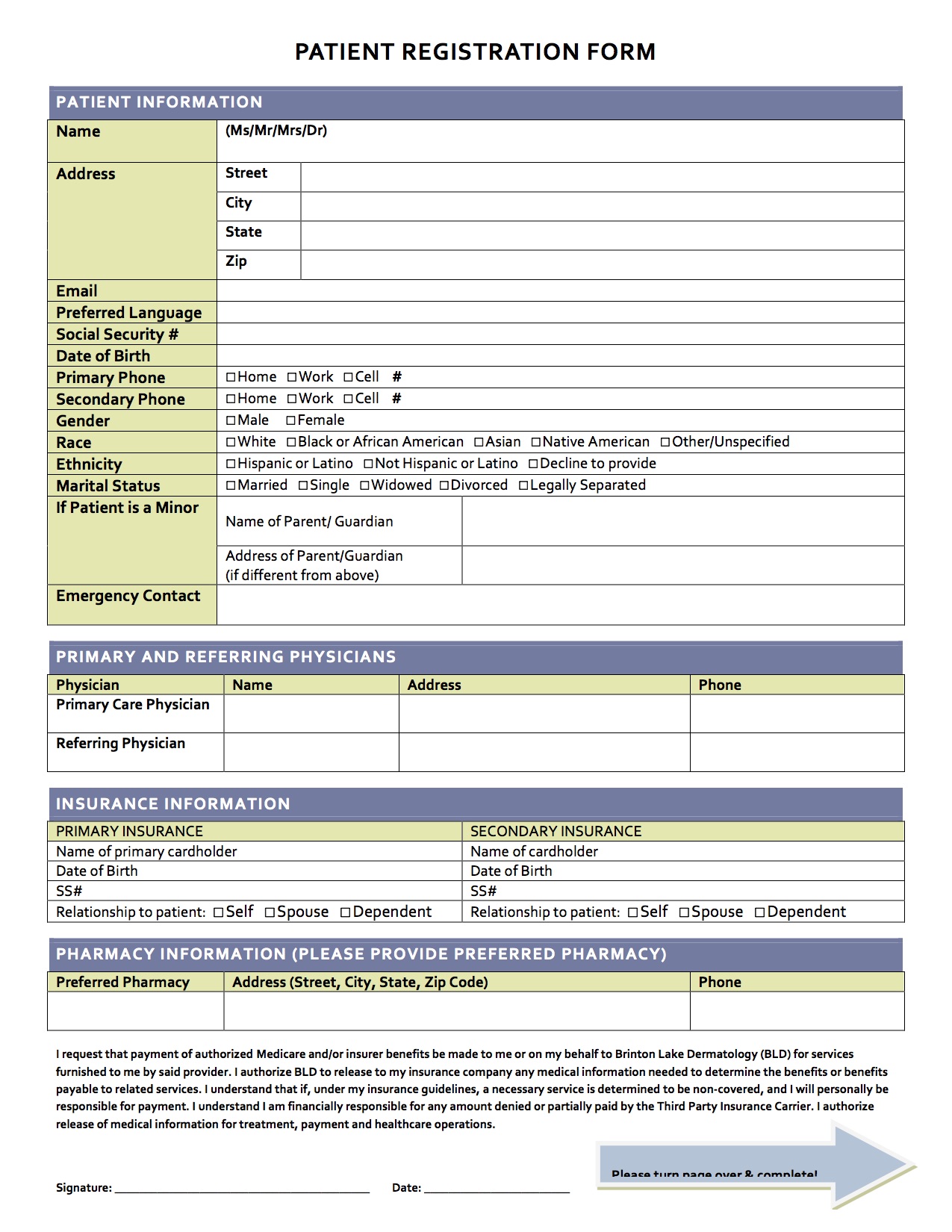
Here are a few issues I had with the design and layout of this form:
- the amount of space to write the address for a parent/guardian is way too little
- the space for emergency contact is quite vague; do you just supply a name, or a name and phone number, or name, phone number, and relationship?
- the space to write in the names and addresses for the primary care physician and referring physician was the biggest problem. it seems most doctors’ addresses are going to include the name of a hospital or medical building, along with a suite number, a street number, and the city , state and zip. How you are expected to fit all of that in in such a small amount of space? Talk about annoying!
- the space to write in your preferred pharmacy is also way too small
- why do zip code, preferred language, social security #, date of birth, and gender require an entire line?
The form does do a few things well:
- unlike many forms I fill out, this one actually has enough space to write in my email address without resorting to using really tiny print. When will form designers realize that an email address usually requires more space than a phone number? This is usually my #1 per peeve associated with filling out forms, but this form actually did it the right way.
- I like how there are separate lines for me to enter my street, city, state and zip code (but note my previous remark about the zip code line). Many forms use the approach noted above with the doctors’ addresses when asking for the patient’s info.
- I also like the use of the check boxes for items like choosing the type of phone number, your gender, race, ethnicity, and marital status. That would seem to lead to fewer errors from trying to read someone’s handwriting.
- I also like the use of different colors coding (or different shading if you print the form in black and white).
I know there are bigger problems in the world than whining about some minor inconveniences associated with filling out a form. But when the fix for such problems is pretty simple, why don’t people just fix it?
By the way, if you want to see another couple of examples of poor form, how about these divers:
and
And if you want to see what good form looks like:
